
Brand Identity · Packaging
A brand that’s recognizable from the box to the listing
Logo, visual system and packaging that keep the same identity across product, Amazon and web.
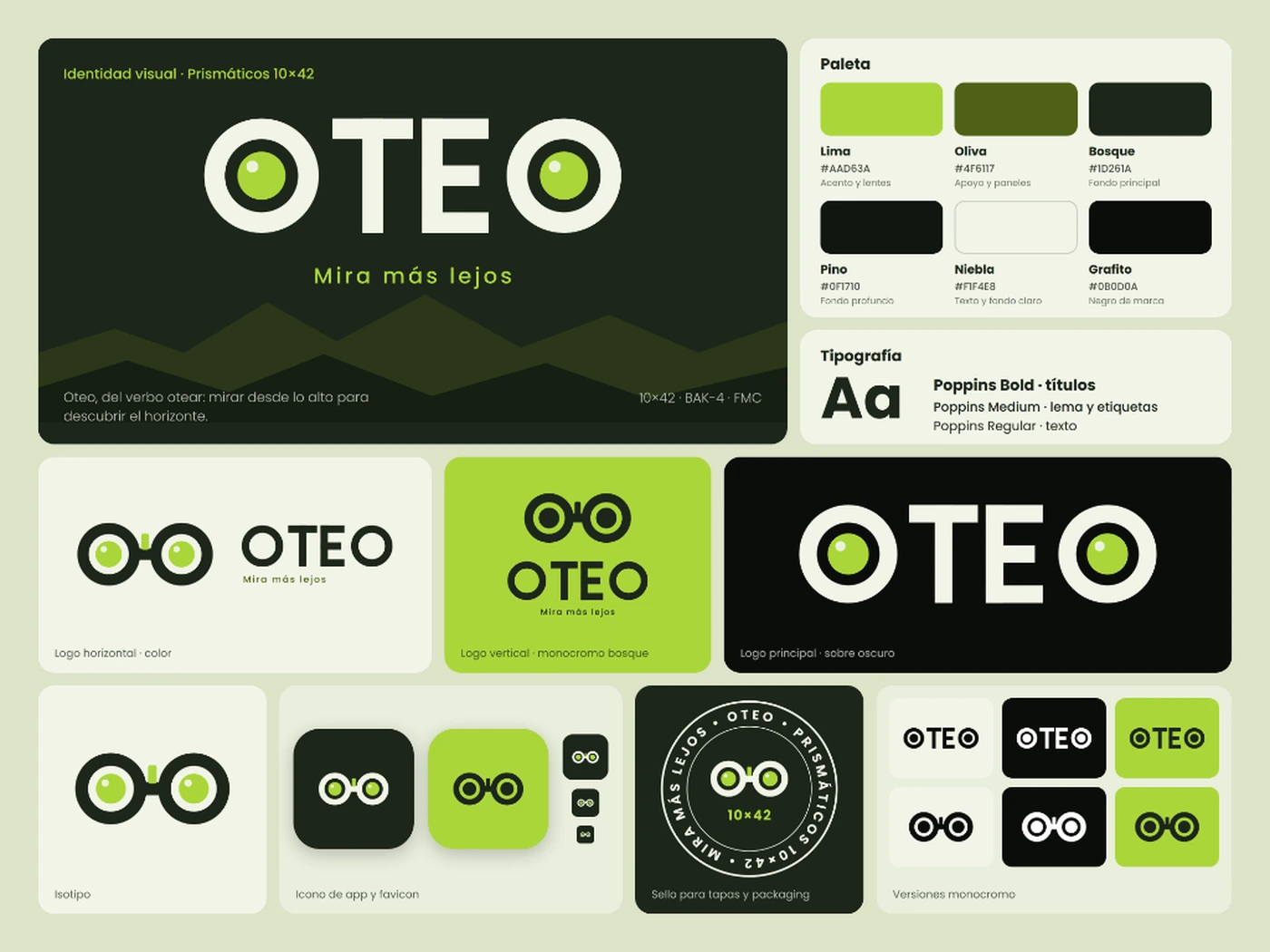
Strategy & Case Deep Dive
Visual decisions engineered for commercial clarity.
A thorough breakdown of challenges, market research, strategic trade-offs and mobile adaptations.
Initial friction detected
The studio needed a flexible language that remained recognizable across different formats.
Market & review analysis
Comparative study of international packaging agencies and analytics SaaS platforms to distill a restrained, authoritative visual voice.
Hierarchy decisions
Color palette anchored in deep forest emerald (#0f241d) and radiant mint (#45d48f), dual typography system, and reusable UI tokens.
Smartphone optimization
Ultra-fluid responsive layout with zero viewport overflow and touch targets exceeding 48 px on all mobile interactions.
Visual sequence & architecture
Every asset has a concrete role in the buyer journey.
- 01Primary identity
- 02Color and typography
- 03Icon system
- 04Web components
- 05Social applications
- 06Commercial material
Final visual result
A coherent system, explained without invented metrics.
Design system deployed across Skuvia Studio’s digital ecosystem, engineered for speed, legibility and cross-platform continuity.
We never invent revenue spikes or artificial conversion metrics; project excellence is demonstrated through strict Amazon compliance, narrative integrity, and the removal of customer purchase friction.
Looking for a similar visual system for your catalog?
Explore our Amazon Brand Story design or compare options in our pricing page.